
VectorBT Pro - Plotting Indicators and Visualising Strategy with Cleaned Signals
In this blog we will see how to visualize our Double Bollinger Band strategy along with the indicators and the cleaned entries/exits from the simulation. You will master your VectorBT Pro plotting skills by creating your own plot_strategy() function and learn how to go from a basic plot like this ⬇

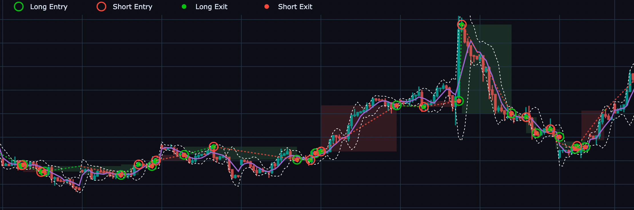
TO this Fancy Advanced Plot 🎉 😎 with stacked figures, entries/exits and layered indicators

Plotting - Basics 👶
As before we will start with the global settings we will use everywhere for our plotting like this dark theme and figure / width.
## Global Plot Settings for vectorBT
vbt.settings.set_theme("dark")
vbt.settings['plotting']['layout']['width'] = 1280
OHLCV Plot
The code to get a basic OHLCV plot is shown below, to get custom plot titles and other attributes you pass it in the kwargs. To make some sensible visualization and not get a super condensed plot we will use .iloc to slice a small sample of the dataframe.
## Plot OHLCV data first
kwargs1 = {"title_text" : "OHLCV Plot", "title_font_size" : 18}
h4_ohlc_sample = h4_df[["Open", "High", "Low", "Close"]].iloc[100:200]#.dropna()
f = h4_ohlc_sample.vbt.ohlcv.plot(**kwargs1)
f.show()
This gives the plot you saw earlier, and yes we see some ugly gaps in the candlestick data, which we will see how to fix later. Let's try to add the Bollinger Bands indicator on top of this basic candlestick plot
OHLCV Plot with Bollinger Bands
h4_bbands.iloc[100:200].plot(fig = f,
                            lowerband_trace_kwargs=dict(fill=None, name = 'BB_Price_Lower'),
                            upperband_trace_kwargs=dict(fill=None, name = 'BB_Price_Upper'),
                            middleband_trace_kwargs=dict(fill=None, name = 'BB_Price_Middle')).show()

The fundamental concept you have to understand in layering elements on a figure is to reference the parent figure, notice how the fig = f in the above Bollinger Band plot is referencing the parent figure object f we first created. Also notice that child objects inherit the styling and other attributes kwargs1 you passed to the parent object. You can ofcourse over-ride them by placing another **kwargs in the plot() function call.
Adding RSI on Stacked SubPlots
So we learnt how to add an indicator to the figure, but what if we want to create stacked subplots, like adding an RSI Indicator below the previous plot. This is essentially done using the vbt.make_subplots() function and the use of the add_trace_kwargs argument inside the plot() function.
kwargs1 = {"title_text" : "H4 OHLCV with BBands on Price and RSI", "title_font_size" : 18,
           "legend" : dict(yanchor="top",y=0.99, xanchor="right",x= 0.25)}

fig = vbt.make_subplots(rows=2,cols=1, shared_xaxes=True, vertical_spacing=0.1)

## Sliced Data
h4_price = h4_df[["Open", "High", "Low", "Close"]]
indices = slice(100,200)
h4_price.iloc[indices].vbt.ohlcv.plot(add_trace_kwargs=dict(row=1, col=1),  fig=fig, **kwargs1)
h4_bbands.iloc[indices].plot(add_trace_kwargs=dict(row=1, col=1),fig=fig,
                            lowerband_trace_kwargs=dict(fill=None, name = 'BB_Price_Lower'),
                            upperband_trace_kwargs=dict(fill=None, name = 'BB_Price_Upper'),
                            middleband_trace_kwargs=dict(fill=None, name = 'BB_Price_Middle'))

h4_rsi.iloc[indices].rename("RSI").vbt.plot(add_trace_kwargs=dict(row=2, col=1),fig=fig, **kwargs1 )

h4_bbands_rsi.iloc[indices].plot(add_trace_kwargs=dict(row=2, col=1),limits=(25, 75),fig=fig,
                            lowerband_trace_kwargs=dict(fill=None, name = 'BB_RSI_Lower'),
                            upperband_trace_kwargs=dict(fill=None, name = 'BB_RSI_Upper'),
                            middleband_trace_kwargs=dict(fill=None, name = 'BB_RSI_Middle'),
                            # xaxis=dict(rangeslider_visible=True) ## Without Range Slider
                            )

fig.update_xaxes(rangebreaks=[dict(values=dt_breaks)])
fig.layout.showlegend = False
fig.show()

Plotting - Advanced 💪
In this section, we will see how to create your own plot_strategy with all the customizations you would want. Please read the inline comments in the code block below to understand the inner workings and details of the various commands
def plot_strategy(slice_lower : str, slice_upper: str, df : pd.DataFrame , rsi : pd.Series,
                  bb_price : vbt.indicators.factory, bb_rsi : vbt.indicators.factory,
                  pf: vbt.portfolio.base.Portfolio, entries: pd.Series = None,
                  exits: pd.Series = None,
                  show_legend : bool = True):
    """Creates a stacked indicator plot for the 2BB strategy.
    Parameters
    ===========
    slice_lower : str, start date of dataframe slice in yyyy.mm.dd format
    slice_upper : str, start date of dataframe slice in yyyy.mm.dd format
    df          : pd.DataFrame, containing the OHLCV data
    rsi         : pd.Series, rsi indicator time series in same freq as df
    bb_price    : vbt.indicators.factory.talib('BBANDS'), computed on df['close'] price
    bb_rsi      : vbt.indicators.factory.talib('BBANDS') computer on RSI
    pf          : vbt.portfolio.base.Portfolio, portfolio simulation object from VBT Pro
    entries     : pd.Series, time series data of long entries
    exits       : pd.Series, time series data of long exits
    show_legend : bool, switch to show or completely hide the legend box on the plot

    Returns
    =======
    fig         : plotly figure object
    """
    kwargs1 = {"title_text" : "H4 OHLCV with BBands on Price and RSI",
               "title_font_size" : 18,
               "height" : 960,
               "legend" : dict(yanchor="top",y=0.99, xanchor="left",x= 0.1)}
    fig = vbt.make_subplots(rows=2,cols=1, shared_xaxes=True, vertical_spacing=0.1)
    ## Filter Data according to date slice
    df_slice = df[["Open", "High", "Low", "Close"]][slice_lower : slice_upper]
    bb_price = bb_price[slice_lower : slice_upper]
    rsi = rsi[slice_lower : slice_upper]
    bb_rsi = bb_rsi[slice_lower : slice_upper]

    ## Retrieve datetime index of rows where price data is NULL
    # retrieve the dates that are in the original datset
    dt_obs = df_slice.index.to_list()
    # Drop rows with missing values
    dt_obs_dropped = df_slice['Close'].dropna().index.to_list()
    # store  dates with missing values
    dt_breaks = [d for d in dt_obs if d not in dt_obs_dropped]

    ## Plot Figures
    df_slice.vbt.ohlcv.plot(add_trace_kwargs=dict(row=1, col=1),  fig=fig, **kwargs1) ## Without Range Slider
    rsi.rename("RSI").vbt.plot(add_trace_kwargs=dict(row=2, col=1), trace_kwargs = dict(connectgaps=True), fig=fig)

    bb_line_style = dict(color="white",width=1, dash="dot")
    bb_price.plot(add_trace_kwargs=dict(row=1, col=1),fig=fig, **kwargs1,
                lowerband_trace_kwargs=dict(fill=None, name = 'BB_Price_Lower', connectgaps=True, line = bb_line_style),
                upperband_trace_kwargs=dict(fill=None, name = 'BB_Price_Upper', connectgaps=True, line = bb_line_style),
                middleband_trace_kwargs=dict(fill=None, name = 'BB_Price_Middle', connectgaps=True) )

    bb_rsi.plot(add_trace_kwargs=dict(row=2, col=1),limits=(25, 75),fig=fig,
                lowerband_trace_kwargs=dict(fill=None, name = 'BB_RSI_Lower', connectgaps=True,line = bb_line_style),
                upperband_trace_kwargs=dict(fill=None, name = 'BB_RSI_Upper', connectgaps=True,line = bb_line_style),
                middleband_trace_kwargs=dict(fill=None, name = 'BB_RSI_Middle', connectgaps=True, visible = False))

    ## Plots Long Entries / Exits and Short Entries / Exits
    pf[slice_lower:slice_upper].plot_trade_signals(add_trace_kwargs=dict(row=1, col=1),fig=fig,
                                                   plot_close=False, plot_positions="lines")

    ## Plot Trade Profit or Loss Boxes
    pf.trades.direction_long[slice_lower : slice_upper].plot(
                                        add_trace_kwargs=dict(row=1, col=1),fig=fig,
                                        plot_close = False,
                                        plot_markers = False
                                        )


    pf.trades.direction_short[slice_lower : slice_upper].plot(
                                            add_trace_kwargs=dict(row=1, col=1),fig=fig,
                                            plot_close = False,
                                            plot_markers = False
                                            )

    if (entries is not None) & (exits is not None):
        ## Slice Entries and Exits
        entries = entries[slice_lower : slice_upper]
        exits = exits[slice_lower : slice_upper]
        ## Add Entries and Long Exits on RSI in lower subplot
        entries.vbt.signals.plot_as_entries(rsi, fig = fig,
                                                add_trace_kwargs=dict(row=2, col=1),
                                                trace_kwargs=dict(name = "Long Entry",
                                                                  marker=dict(color="limegreen")
                                                                  ))

        exits.vbt.signals.plot_as_exits(rsi, fig = fig,
                                            add_trace_kwargs=dict(row=2, col=1),
                                            trace_kwargs=dict(name = "Short Entry",
                                                              marker=dict(color="red"),
                                                            #   showlegend = False ## To hide this from the legend
                                                              )
                                            )

    fig.update_xaxes(rangebreaks=[dict(values=dt_breaks)])
    fig.layout.showlegend = show_legend
    # fig.write_html(f"2BB_Strategy_{slice_lower}_to_{slice_upper}.html")

    return fig
slice_lower = '2019.11.01'
slice_higher = '2019.12.31'

fig = plot_strategy(slice_lower, slice_higher, h4_data.get(), h4_rsi,
                           h4_bbands, h4_bbands_rsi, pf,
                           clean_h4_entries, clean_h4_exits,
                           show_legend = True)

# fig.show_svg()
fig.show()
Notes:
- We are using the H4 timeframe data for our plotting, as the
15Tbaseline data series results in a very dense looking plot which slows down the interactive plot. - We are passing a slice of the time series dataframe in order to avoid a dense, highly cluttered plot. You can make this interactive also if you were to use
plotly-dash(a topic for another blog post perhaps 😃 ) - The gaps in the OHLCV candlesticks on weekends are fixed by storing the dates with missing values in the
dt_breaksvariable and passing this in therangebreaks=[dict(values=dt_breaks)]argument in thefig.update_xaxes()method to filter our the missing dates in the x-axes. - We fixed the gaps occuring in the bollinger bands (due to weekend market closures) by using the
connectgaps = Trueargument in each_trace_kwargsof the bollinger bands. - Note, that you may wonder why we are naming the legends entries and exits in the RSI subplot below as
Long EntriesandShort Entriesand not four distinct labels as in the first subplot.- This is because since we set
direction = bothin thepf.simulationthe Short Entry is basically an Exit for the previous Long position and similarly, a Long Entry is basically an exit for the previous short position. This type of nomenclature setting makes the plot also usable for other settings like when you would want to setdirection = longonlyin thepf.simulationin which case you can just call these legend itemsLong EntriesandLong Exitson the RSI subplot.
- This is because since we set
Cleaning entries and exits
You might have noticed in the last code block we were using clean_h4_entries and clean_h4_exits. Lets understand why we did that? Before we plot any entries and exits for visual analysis, it is imperative to clean them. We will continue with the entries and exits at the end of our previous tutorial Strategy Development and Signal Generation in order to explain how we can go about cleaning and resampling entry & exit signals.
entries = mtf_df.signal == 1.0
exits = mtf_df.signal == -1.0
The total nr. of actual signals in the entries and exits array is computed by the vbt.signals.total() accessor method.
print(f"Length of Entries (array): {len(entries)} || Length of Exits (array): {len(exits)}" )
print(f"Total Nr. of Entry Signals: {entries.vbt.signals.total()} || \
        Total Nr. of Exit Signals: {exits.vbt.signals.total()}")
Output:
Length of Entries (array): 105188 || Length of Exits (array): 105188
Total Nr. of Entry Signals: 2135 || Total Nr. of Exit Signals: 1568
Why do you want to clean the entries and exits?
From the print statement output we can see that in the entire length of the dataframe 105188 on 15T frequency, we can see that the total number of raw entry and raw exit signals is 2135 and 1568 respectively, which is prior to any cleaning. Currently there are many duplicate signals in the entries and exits, and this discrepancy between entries and exits need to be resolved by cleaning.
Cleaning entry and exit signals is easily done by vbt.signals.clean() accessor and after cleaning each entry signal has a corresponding exit signal. When we validate the total number of clean entry and clean exit signals using the vbt.signals.total() method now, we can now see the cleaned entry and exit signals total to be 268 and 267 respectively.
## Clean redundant and duplicate signals
clean_entries, clean_exits = entries.vbt.signals.clean(exits)
print(f"Length of Clean_Entries Array: {len(clean_entries)} || Length of Clean_Exits Array: {len(clean_exits)}" )
print(f"Total nr. of Entry Signals in Clean_Entry Array: {clean_entries.vbt.signals.total()} || \
        Total nr. of Exit Signals in Clean_Exit Array: {clean_exits.vbt.signals.total()}")
Output
Length of Clean_Entries Array: 105188 || Length of Clean_Exits Array: 105188
Total nr. of Entry Signals in Clean_Entry Array: 268 || Total nr. of Exit Signals in Clean_Exit Array: 267
Could you think of a reason why there is a difference of one signal between the
clean_entryandclean_exitsignals ?
- This is happening because the most recent (entry) position that was last opened, has not been closed out.
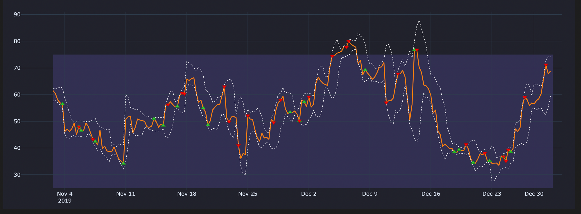
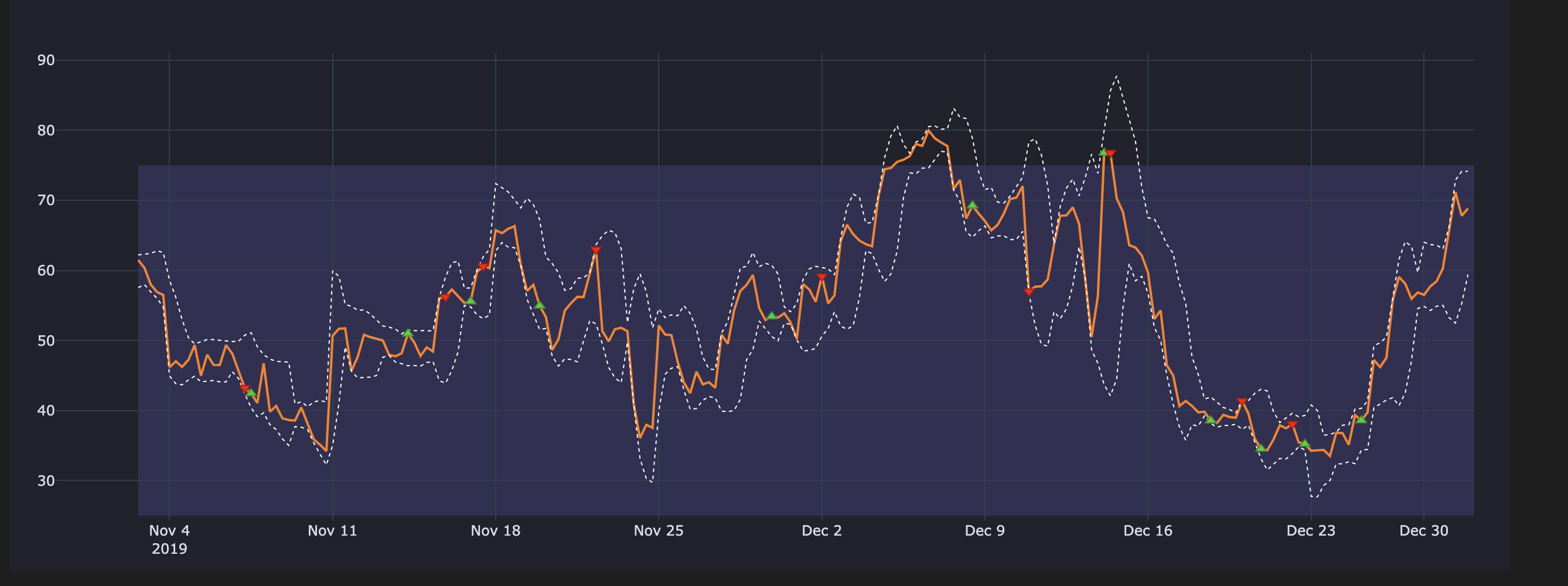
Cleaning Signals - Visual Difference
The below plots will make it easier when understanding what happens if we use uncleaned signals
Uncleaned Entries & Exits on our RSI Plot
Cleaned Entries & Exits on our RSI plot
Resampling entries and exits to H4 timeframe
Resampling any entries/exits is only required when we are concerned with analyzing (plotting, counting etc.) and visualizing our strategy and entries/exits on a timeframe different from the baseline frequency of our strategy. It is always recommended to first clean the raw entries/exits array and then do the resampling.
When do we need to upsample and downsample entries & exits?
- Downsampling of entries/exists is required if we want to do any visual analysis on a timeframe higher than that our baseline frequency of our strategy.
- For eg, in the below code we show a case of Downsampling our entries/exits on the 15m timeframe to H4 timeframe. Downsampling comes with the
riskof information loss.
- For eg, in the below code we show a case of Downsampling our entries/exits on the 15m timeframe to H4 timeframe. Downsampling comes with the
- Upsampling of entries/exits is required, if we want to do any visual analysis on a timeframe lower than that our baseline frequency of our strategy.
- For example, you have some crossover on 4h frequency and you want to combine the signals with some other crossover on 15 min frequency, then you would need to upsample signals from 4h->15min, which would cause no problems because there is no information loss in upsampling
clean_h4_entries = clean_entries.vbt.resample_apply("4h", "any", wrap_kwargs=dict(dtype=bool))
clean_h4_exits = clean_exits.vbt.resample_apply("4h", "any", wrap_kwargs=dict(dtype=bool))

print(f"Length of H4_Entries (array): {len(clean_h4_entries)} || Length of H4_Exits (array): {len(clean_h4_exits)}" )
print(f"Total nr. of H4_Entry Signals: {clean_h4_entries.vbt.signals.total()} || \
        Total nr. of H4_Exit Signals: {clean_h4_exits.vbt.signals.total()}")
Output
Length of H4_Entries (array): 6575 || Length of H4_Exits (array): 6575
Total nr. of H4_Entry Signals: 263 || Total nr. of H4_Exit Signals: 263
Information Loss during downsampling
From the above output we see the nr. of signals on the clean_h4_entries and clean_h4_exits as 263 respectively, this shows a loss of information during this Downsampling process. This information loss occurs because by aggregating signals during downsampling, our data becomes less granular.
⭐ Key Points
- How information loss occurs during downsampling of entries/exits?
- Let's say we have
[entry, entry, exit, exit, entry, entry]in our signal array, after cleaning we'll get[entry, exit, entry], but after aggregating the original signal sequence you'll get just{entry:4 ; exit:2}, which clearly cannot after cleaning produce the same sequence as on the smaller (more granular) timeframe. - The problem here is that the information loss occured during
downsamplingthe cleaned entries and exits, ignores any exit that could have closed the position if you back tested on the original timeframe (15Tin our example), that is why we end up seeing 263 || 263 in the above print statement.
- Let's say we have
- After downsampling if we want to retrace the order of signals and we want to investigate "Which signal came first in the original timeframe ?", we encounter a irresolvible problem. We can't resample 1m (minutely) data to one year timeframe and then expect the signal count to be the same even though our new data is all fitting in only one bar (1D candle).
By changing the method to sum and removing the wrap_kwargs argument in the vbt.resample_apply() method we can aggregate the signals and show the aggregated nr. of signals.
## sum() will aggregate the signals
h4_entries_agg = clean_entries.vbt.resample_apply("4h", "sum")
h4_exits_agg = clean_exits.vbt.resample_apply("4h", "sum")

## h4_extries_agg is not a vbt object so vbt.signals.total() accessor will not work
## and thus we use the pandas sum() method in the print statement below
print(f"Length of H4_Entries (array): {len(h4_entries_agg)} || Length of H4_Exits (array): {len(h4_exits_agg)}" )
print(f"Aggregated H4_Entry Signals: {int(h4_entries_agg.sum())} || Aggregated H4_Exit Signals: {int(h4_exits_agg.sum())}")
Output
Length of H4_Entries (array): 6575 || Length of H4_Exits (array): 6575
Aggregated H4_Entry Signals: 268   || Aggregated H4_Exit Signals: 267
Though the result of this aggregation shows the same result we got above when printing the clean_entries.vbt.signals.total() and clean_exits.vbt.signals.total(), this does not help us in inferring the true order of the signals and the information loss created by downsampling cannot be compensated by aggregation.
Do we have to resample entries/exits for running the backtesting simulation?
When you are doing portfolio simulation (backtesting), using thefrom_signals()which we see in the previous blog post - Strategy Development and Signal Generation, thefrom_signalsmethod automatically cleans the entries and exits , therefore there is no reason to do resampling or cleaning of any entries and exits.
Irrespective of whether we use the clean entries and exits or just the regular entries and exits in the simulation/backtest when runningfrom_signals()it will make no difference. You can try this for yourself and see the results will be the same.